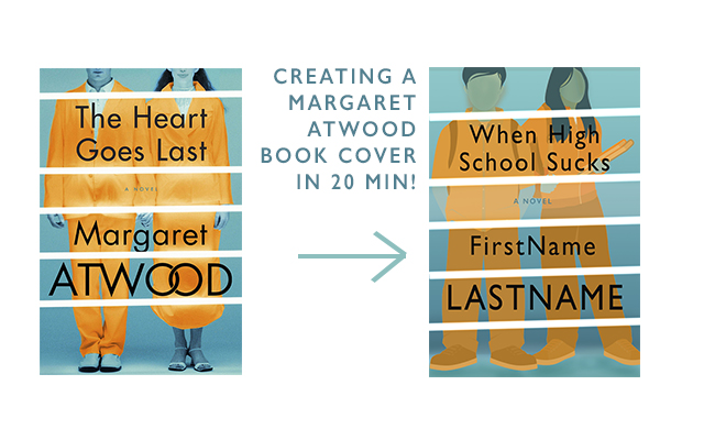
Tutorial: Making A Margaret Atwood Cover in 20 Minutes
I was looking at book covers online, as one does, and saw Margaret Atwood’s The Heart Goes Last. The colors are quite catching, and I wondered if I could recreate a similar cover. Here is the result of that, with step-by-step instructions. You will notice right off the bat that in my two-minute Google search I couldn’t find a free for use photo of a couple like the one that Atwood’s book designer used. So, instead, I used a vector graphic. I think it makes my version of the cover look a bit more like a young adult novel (hence my faux-title).
Tutorial: Creating Ebook Promotional Images for Free
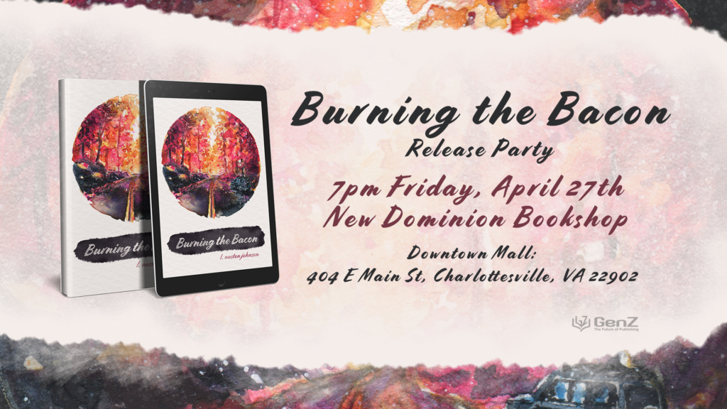
So you have your cover, and it looks amazing. But your book has been out for a little and isn’t selling that well. How do you give it a face lift? One way you can be successful at this is through using clean promotional images (like the one above). This post will teach you some basic graphic design tutorials, so you can make your own high quality promotional and marketing material.
This is useful for ALL authors, from traditionally published to self-published, because people/fans/readers (especially on social media) do care about aesthetics, and showing your book off in an attractive way can help it sell.
Review: Salt by Nayyirah Waheed

My review of Salt by Nayyirah Waheed:
Rating: 2.5 stars: “It was okay”
Waheed tackles some important and tough subjects like the African diaspora, motherhood, the ways in which feminism can benefit men, and sexual assault. She has some very quotable short poems but in general I found the collection to be a bit awkward to read through. The choppy lines hindered my reading of the poem, and at some points it was too straight-forward, and at other times, it felt like it was too purple, that I didn’t really know what she was trying to say. To be fair, I read it on Kindle, which is not the best way to digest poetry like this, so it may have been an easier reading on my eyes if I read the paperback.


