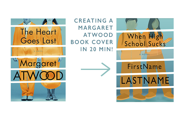
I was looking at book covers online, as one does, and saw Margaret Atwood’s The Heart Goes Last. The colors are quite catching, and I wondered if I could recreate a similar cover. Here is the result of that, with step-by-step instructions. You will notice right off the bat that in my two-minute Google search I couldn’t find a free for use photo of a couple like the one that Atwood’s book designer used. So, instead, I used a vector graphic. I think it makes my version of the cover look a bit more like a young adult novel (hence my faux-title).
Part 1: Gather Supplies
As I said, use the power of Google’s advanced search to find a free-for-commercial-use image. Here’s an image in case you don’t know how to do that. Click advanced settings and down at the bottom there’s a section called “usage rights.” Select the one you need for your project:

The other thing you’re going to need is Photoshop. My other tutorials used Canva and Crello, which are free online platforms. I didn’t see a way to do this in those, because they don’t have the same variety of tools, but you could probably use a free program like GIMP.
Step 2: Putting the Image Together
This tutorial has a few more steps than my previous ones, but overall it should actually take less time, because we don’t have to do any workarounds in Photoshop, since it’s such a powerful tool.
1. Set up your file. I’m working for a 6 x 9in with a little bit of bleed. Put in your stock image.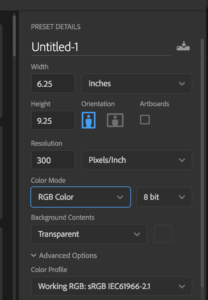
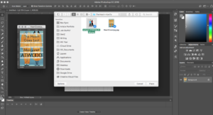
2. Next, delete the background of the stock photo (if there is one) and create a gradient background. I’m using Atwood’s original photo to pick the colors for mine. We want to mimic the slight change in color the original cover has, so pick one color from the top and one color from the bottom to be your gradient.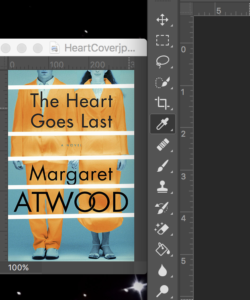
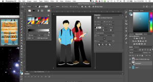
3. Now we’re going to color the people. To do so, we need to duplicate the people layer. Anything that’s blue (the hair, hands, neck) we want to erase from the top people layer. The top layer will instead be the orange color. We’ll achieve that by using the “color overlay” feature, setting the color to the orange from the original color and putting the opacity at around 77%.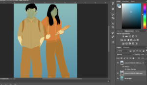
I did a vague coloring of the faces before really getting into the orange, so that as I erased the orange layer I could start to see the transformation. If you want to do all of the coloring with the paint bucket instead, that should be fine for vector art. If you’re using an actual photograph, you will probably have to hand color using a brush tool. 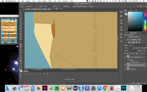
I zoomed in when erasing to make sure everything was clean. To clear the way for the blue, I used a mixture of the magic eraser and brush eraser (set on just a soft brush and 55% or so opacity). Then, I used the same style of brush with different opacity settings for coloring the blue and erasing:
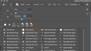
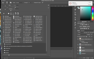
If your image is as vector-heavy as mine, you can even use the paint bucket tool set to a lower opacity to fill in the blue areas and to make the orange areas pop. Here, you should also color the hair blue (not pictured in my images because I forgot until later).
4. My oranges were fairly uneven, and so I balanced them out by using the paint bucket tool set with an orange that I picked from Atwood’s original cover:
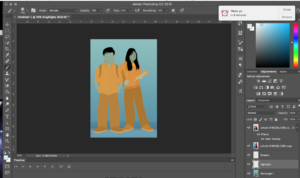
5. After recoloring the oranges, I created the shadows. Again, I picked a color from the Atwood image.
6. My shadow didn’t have the exact transition I wanted, so I added a highlight and then picked a greener color from the Atwood image to do a more subtle shadow over the highlight. Play with the layer opacity to make it as subtle or as obvious at you want. For my highlight, I had the brush on 21% opacity and then I still messed around with the layer opacity until I got it how I wanted it. 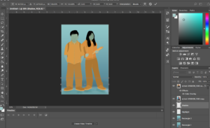
7. Now we want to start putting in the lines. I actually used the rectangle feature instead of the line feature, because I find it easier to control the width of my marks that way. Atwood’s lines are at a slight angle, so I made mine slant as well:
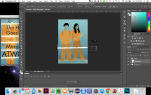
8. Next, duplicate the line layer. Atwood had five lines, so that’s what I went with as well. You may notice that I also made my people bigger. This was to match up more closely with the scale of Atwood’s cover, where the people’s faces are being cut off. It’s really up to you if you’d rather have the heads cut off or not. If you’re going to scale after you’ve done the other steps, make sure to select every layer that needs scaling. For me, that was the two people layers, the highlight layer, and the shadow layer.
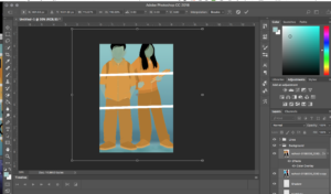
9. With your lines in, we can start adding the text. For the text, I’m using the font Gill Sans, but it doesn’t seem to be a 100% match. If you want to dedicate time to doing an exact match, more power to you, but I was content to use Gill Sans for my work. It was around this time that I realized I forgot to color the hair blue. I did so using the paint bucket tool set on 33% opacity.
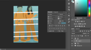
For the words “A Novel” the Atwood cover used all caps and had the letter spacing fairly far apart. Use the text options to mimic that style. Even if you’re font isn’t the same as hers, you can still implement some of the same text settings.
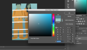
Then, resize the font and center it, using the guidelines. I kept them hidden earlier in the tutorial, because they’re distracting to me, but they’re useful for making sure your content in centered.
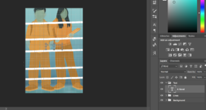
10. Now, add the other text and center it. As you go along, you will probably have to futz with the line spacing.
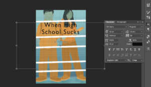
11. Play around with text thickness, width, and spacing until you like what you see.
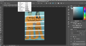
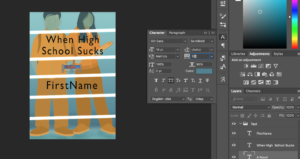
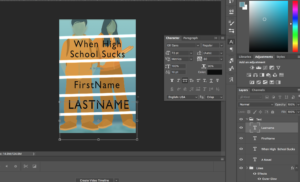
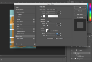
12. Now, we have to add the line glow. Atwood’s cover has a soft glow. To achieve that, I used the outer glow feature, changing the shape of my contour curve.
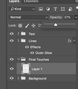
13. Add the final highlighting. Atwood’s cover has a ban of brightness in the middle. This is probably as a result of the photo she picked, which has deeper layers of fabric. To mimic that look, I put a stripe of white on low opacity in the section where my “A Novel” text sits.
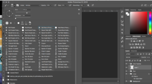
14. Finally, after quite a few steps, we’re all done. Design time: 20-30 minutes, or, if you’re really good, even less than that. The part that took the longest for me was fenagaling colors and text to make them match closely with Atwood’s original cover.
Step 3: The final product

How do you think I did? Leave you comments, questions, and suggestions below. And, let me know if there’s a tutorial you really want to see in the future. Would you use a cover like this?
