We all know that what’s between the pages of a book is what counts, but it’s also nice to fawn over lovely covers. Here are covers for books coming out June 2018 that I love.
 1. A River in Darkness by Masaji Ishikawa
The cover for A River in Darkness is clean and evocative, which is fitting for its impactful story. The topographical background adds dimension while suggesting movement, and the red of the barbed wire river hints at the atrocities conveyed within its pages. I like the serif font they chose for the main title, and having the barbed wire wrap around the text is a clever move. In terms of any negatives on this cover, I only wish they had picked a different font for the subtitle words “One Man’s Escape from North Korea,” because it seems too digital to me. It would be nice also if they had carried that yellow-beige of “A memoir” to some other text on the page, but that really doesn’t affect my viewing of the cover at all. The brilliant cover designer is Rachel Adam Rogers, and you can see more of her work here.
Add it to your Goodreads shelf here.
 2. Smoke in the Sun by Renee Ahdieh (Flame in the Mist #2)
This cover is fun and pretty. I love that it clearly shows the book’s Asian influences and depicts the main character, a WOC, explicitly. The dragon/smoke hybrids are a nice artistic touch, and I’m always a sucker for flowers on a book cover. The cover model has beautiful, piercing eyes, and the font similarly balances beauty, grace, and ferocity. The cover has diverged quite a bit from the original first book in the series; it uses different colors, iconography, and fonts. However, both covers include the cherry blossom flowers. Having not read the books, I can only guess that they are important images for the series. However, it matches up with the new cover scheme, which is displayed on Amazon. Continuity between books in the same series is always satisfying to see. Book design is by Eileen Savage, whose work you can see here.
Add Smoke in the Sun to your Goodreads shelf here.
 3. Still Lives by Maria Hummel
I’m a sucker for the geometric. Still Lives is (partially) about a women who gets wrapped up into the world of art, and we see her confusion through the fragmented statuesque faces on the cover. I love how the breaking of habit and this woman’s life is reflected in the breaking of the text. The entire cover seems a bit like a stutter, a double-take, a kaleidoscopic rabbit hole. In a nod to the art world, the cover plays with primary colors, but it has shifted them just enough that the orange-red and the blue are good complements to one another. Regarding typography, I find the Arial-esque font a bit boring for the author name, but the rest of the cover is so loud, it makes a good foil for the cover’s sensory experience. I couldn’t find a cover artist, but Counterpoint Press in general has a lot of lovely covers. They are big on bookstagram as well. Check out their website here.
Add Still Lives to your Goodreads shelf here.

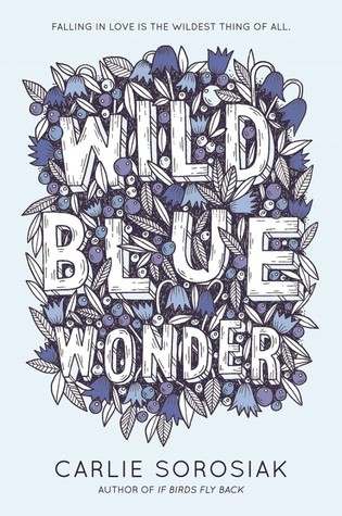
4. Wild Blue Wonder by Carlie Sorosiak
I’ve already told you that I’m a sucker for flowers on a book cover. I’m also a sucker for handlettering. The nested, custom text signs to my soul, and I like that the natural chaos of the title font section is contained and the negative space of the background shines through. The author font is satisfying and clean without being clinical, and I like that the cover is not oversaturated. There’s another version of the cover that you may see on sites like Amazon, which is primary-color-heavy and shines of “fun, summer read,” but I prefer this version. You can see what I mean here. Comment below if you know the cover designer.
Add Wild Blue Wonder to your Goodreads shelf here.
 5. Small Country by Gael Faye
What screams bildungsroman more than a jumping boy? There’s something just a little bit off about this cover, but I think that’s what makes me keep looking at it. The central action is a bit to the right. The gradient of the landscape scene seems just a little unreal. I’m not sure what the textured graphite patterns are in the background. But, it works. I like the handwritten, seemingly haphazard text. And I like the double-exposure look of the boy and his country. It fits this quote from the book’s summary: “Small Country describes an end of innocence as seen through the eyes of a child caught in the maelstrom of history.” Many books are coming-of-age stories not just for their protagonists but for their countries, and this book cover captures that dual development without much strain. The jacket design is by Rachel Willey. You can see a bit more of her work featured on The Casual Optimist here.
Add Small Country to your Goodreads shelf here.
There are many great book covers that I didn’t get to here, including a lot of great indie books. Look out for more #coverlove on my social media and comment your favorite covers below!


 2. Smoke in the Sun by Renee Ahdieh (Flame in the Mist #2)
 3. Still Lives by Maria Hummel
 5. Small Country by Gael Faye
