As an indie author, it’s important that you present yourself as well as your work as attractive to potential readers. A good way to do this is to keep your social media coherent and to publish high quality, aesthetically-appealing graphics. One of the best mediums to post pretty pictures on is Instagram. In this tutorial, I’m going to show you how to create your own quote graphics for FREE that will elevate your page, making it seem more modern and professional.
First things first, pick your preferred graphic tool. If you don’t have Photoshop, no worries, there are many free online programs, like Crello, Canva, and Vectr. Since I used Canva in my January Patreon post, I’m going to switch it up. In this tutorial, I’m going to be using Crello to design quotation graphics with a personalized flare for use on social media.
1) Choose your medium. I personally think quotations work best for media like Pinterest and Instagram. I’m going to be making an Instagram image (1080 x 1080p). Crello has many pre-designed themes to choose from:

2) Add your text! The way Crello creates these beautiful templates involves breaking down the text into smaller parts and using typography:

It will be useful to have your quote in plain text format as you’re working, so paste it into your Crello workspace without any formatting. I started by just transferring my text to the template, putting the most important part of the quotes in the largest letters. It still looks messy, but that’s okay!

3) Clean up your quote and resize font. I moved my words around and tried to make the colors of the piece match the words better.

It still seemed awkward to me so I added another step…
4) Change font and graphics to fit your quote. Play around with typeface, spacing, line height, and color. Notice in the image below how switching the font changes the tone of the image slightly:

Using such a digital-looking sans serif adds a level or formality that was lacking. I don’t think it works for my image, but if you’re an scify, non-fiction, or dystopian author, it could work very well.
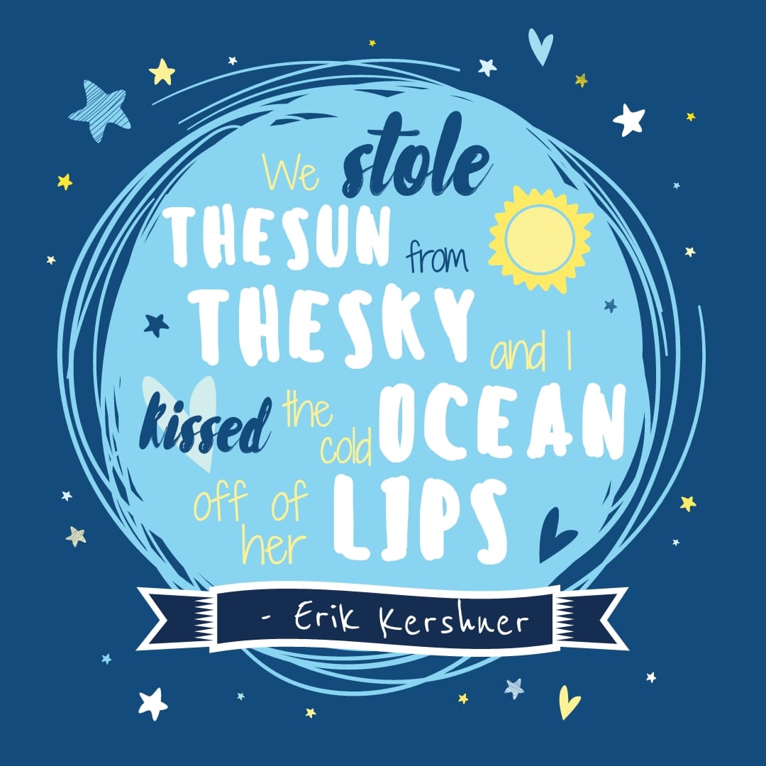
5) Change the final design elements. For my quote, I thought change the color palette to teal/mint wasn’t enough. With the stars in the background, I wanted to make it seem like a clash between day and night, like what would happen (among other things) if the sun were really stolen.
I made the decision to get rid of the pinks and reds, because the quote is romantic enough without being in the reader’s face with romantic colors. Here’s what I ended up with.

Total time to create: 30 minutes. Messing with the sizing and positioning took the longest out of everything, and if you choose to just stick with the tutorial layout, it would make everything a lot quicker.


Pingback: Design Tutorial: Creating Ebook Promotional Images for Free
Pingback: Tutorial: Making a Margaret Atwood Cover in 20 Minutes or Less